Americana,
Type of industry
Education
Services offered
Re-branding
Brand strategy
Relaunching
Commercial
Audiovisual production
Location
Barranquilla, Colombia
Date
2021
The American University Corporation is a university institution, which today has 3 branches nationwide in the cities of Barranquilla, Medellín and Montería, with more than 11 thousand current students nationwide in 2021 and this year they celebrate 15 years since its creation. and they want to do a brand update: redesign their logo and relaunch their new image at a local event.
The challenge
Doing the rebranding and brand relaunch of an educational institution that already has a track record and is recognized within its niche, must be done with the greatest possible care and investigation. The entire development of the brand update strategy, image redesign is proposed corporate, including logo and visual communication, and launch of a new commercial and institutional video based on the new concept created.
The strategy
After doing extensive marketing research, competitor analysis, and interviewing more than 170 people including students, staff, and professors of the Institution, I discovered that the ideal client is very diverse, with multiple ages and different socio-cultural histories, and so on. I came to the following question:
The Americana student is like the great characters who have marked human history, such as Walt Disney or Charles Darwin, who fought tirelessly for their dreams, who started from scratch to achieve their goals, who at some point were rejected, mocked, and that at first no one believed in them but that they never, ever gave up.
Since they started from nothing, nobody knew them, but their persistence, dedication and study did not let them abandon the process until someone came along who believed and supported them to grow and develop their purposes! Without that “someone” who supported them, they might never have gotten to where they did.
And that’s us! THE AMERICAN IS THAT
FRIENDLY HAND THAT DID BELIEVE.
Production and audiovisual direction of the institutional video of the new brand applying the new relaunch strategy.
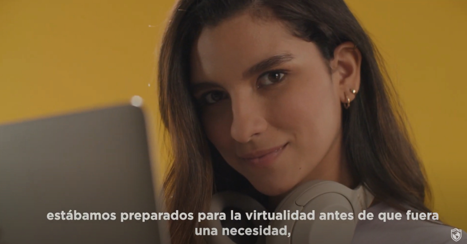
The video shows all the benefits of studying at La Americana, impressive figures and how we can transform the world together through education.
The hero

The friendly hand of the American
It represents help, protection, security, accompaniment, motivation and essential tools for the integral development of the student.
Nature

The unstoppable force of nature and the alliance of the 3 national headquarters united under the same purpose: to bring quality education.
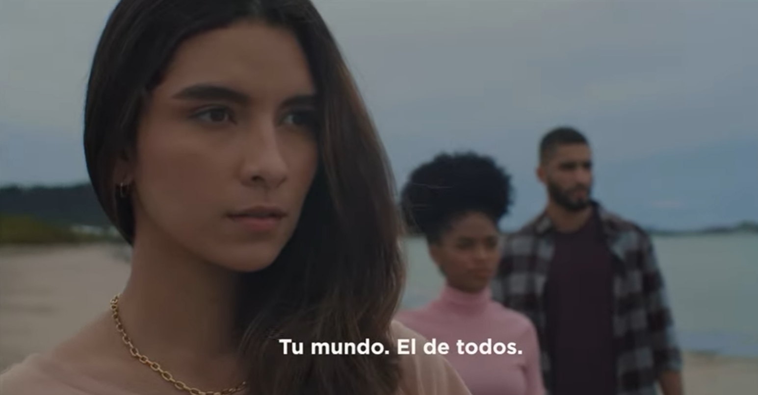
The world

The interconnectivity and internationalization of the Americana, a digital world.
Equity and inclusion, to access education from anywhere in the world.
The logo was updated, modernizing the shield and making it more digital and 2D. Elements such as the world and the shield were kept but updating the style and meaning.
The design of the symbol was stylized, including the curves that represent the connection between the geography of the 3 venues:
The result


")
")
")
")


Creativity, energy, efficiency, are words that describe what Wen can bring to a brand. Thanks to his work, we were able to develop the transformation of the brand and institutional image that we needed in La Litoral.
The concept of #LaNuevaGeneración has allowed us to connect with the mind and feelings of the public we needed to address, obtaining notable results in the variables of brand positioning and population growth.
His work speaks for itself! Thank you
– Alba Corredor,
CEO of La Litoral, Institute of Higher Education
